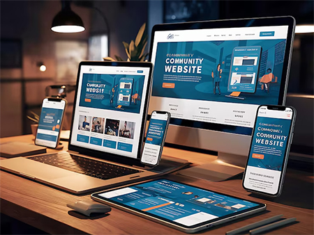
Responsive Web Design
Adaptive layouts and mobile-first design so websites look great on phones, tablets, and desktops.
Our web design focuses on user-centric, responsive sites. We ensure UX/UI excellence with clean visual design and accessibility for all users. We build for mobile first, creating fast, SEO-friendly websites and Progressive Web Apps that work on any device. In app development, we choose the best platform and technology (native or cross-platform frameworks) for each project. We deliver polished interfaces, robust performance, and full testing (security, performance, usability). After launch, we handle maintenance and updates to keep apps up-to-date with the latest OS and device standards.

Adaptive layouts and mobile-first design so websites look great on phones, tablets, and desktops.

WCAG-compliant design, intuitive navigation, and usability testing to reach broad audiences.

HTML5, CSS3, JavaScript frameworks (React, Vue) for dynamic, interactive websites

Fast-loading pages, semantic markup, and on-page SEO best practices built in.
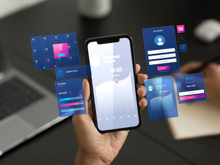
Cross-platform mobile apps (iOS/Android) using React Native, Flutter, or native tools, plus web apps/PWAs.

Wireframes and prototypes with user testing to ensure intuitive app experiences.

Secure database and API integration for dynamic content (Node.js, Python, etc.), plus cloud services.

Publishing to App Stores, ongoing maintenance, analytics integration, and updates based on user feedback.